BC Ministry of Transportation
Quartech
Product Designer / Visual

Project Overview
Joined a 10-year project to align it with the BC Government brand and improve accessibility. Transitioned all files from UX Pin to Figma, created wireframes and mockups, and acted as a liaison among developers, testers, and BAs. Conducted user interviews and supported BA tasks as needed.
Key Responsibilities & Contributions:
• Joined Quartech to improve usability, accessibility, and consistency for a BC Government enterprise product with only 5 users and fragmented design tools
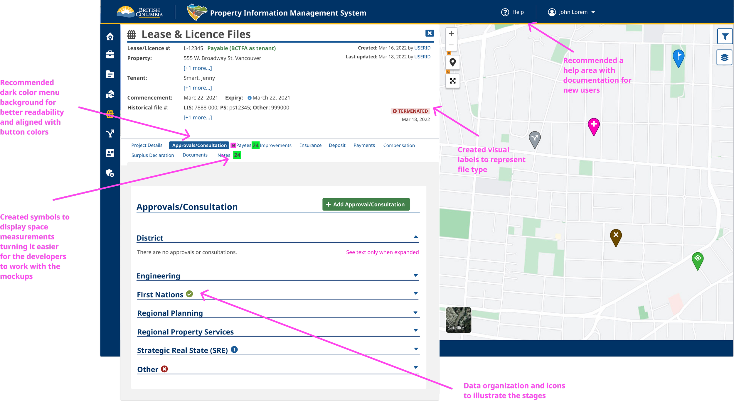
• Redesigned navigation, dashboards, tables, search flows, and data visualizations to create a more intuitive experience
• Created a unified Figma Design System, moving away from UXPin, to ensure design consistency across the product
• Ensured WCAG AA compliance for inclusive design
• Conducted user research and 1:1 interviews to inform design decisions
• Collaborated closely with developers, Product Owners, and stakeholders to align design with roadmap priorities
Impact / Results:
• User adoption grew from 5 to 200+ users within a year
• Improved accessibility, clarity, and overall user experience
• Stakeholders consistently praised the product’s usability, visual quality, and workflow improvements
Impact > Feedback:
Improved user experience, navigation, and product consistency, receiving praise from clients, users, and developers:
"You are making great improvements, and you have great attention to detail :)"
TP, Client/User"The improvements recently made on the UI/UX are amazing! Thank you for your hard work!"
AM, Client/User"I don’t say it much, Ana, but I appreciate all the hard work you have been doing on the project. In one year, our User Experience has improved immensely!"
CJ, Direct manager/Product Owner"Ana has been turning our product more pleasant and beautiful."
MR, Developer"This is our fantastic UI/UX Designer."
DP, Client, while introducing Ana to the Ministry of Transportation CEO.
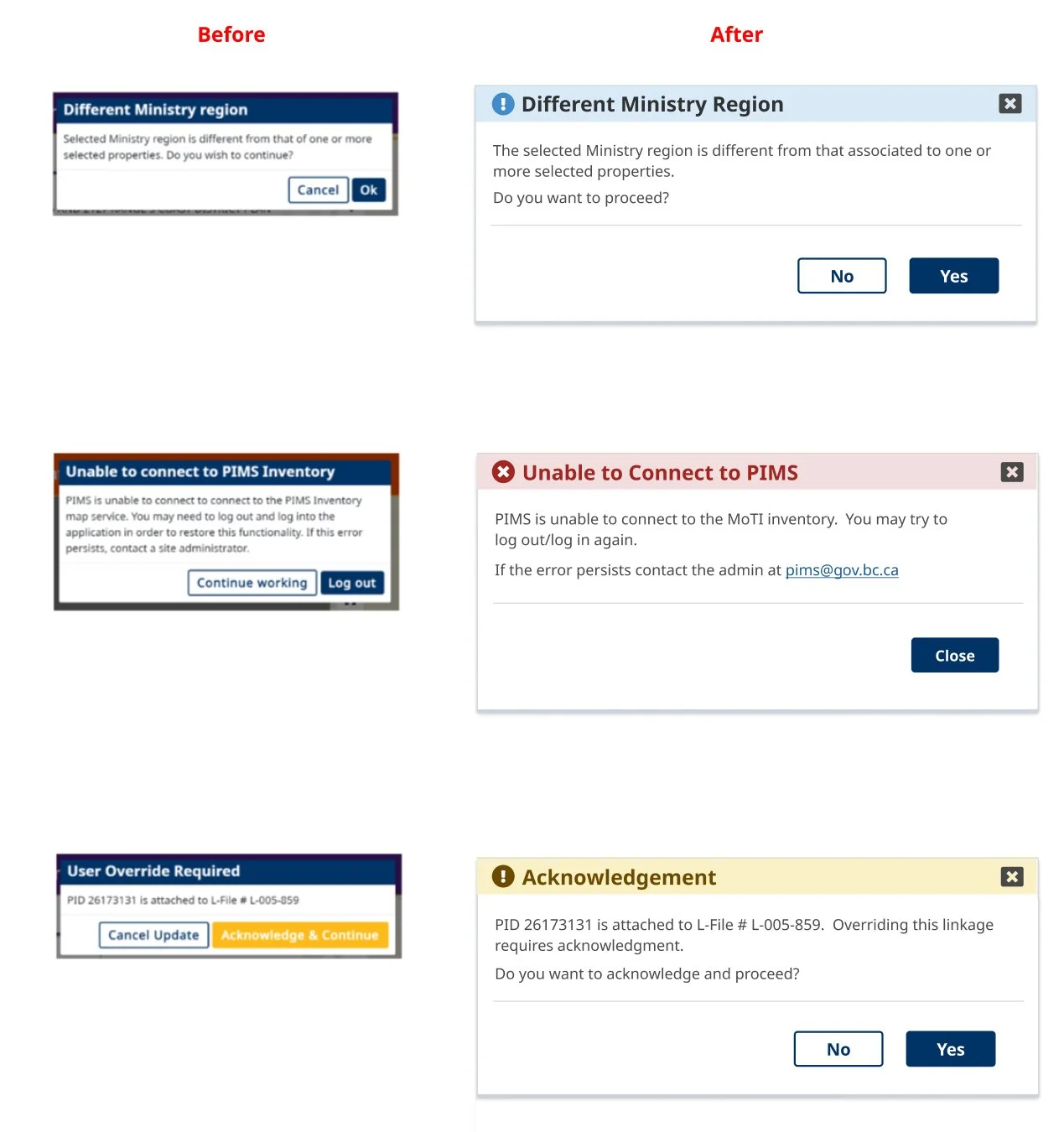
Redesigned interface to enhance readability and usability, creating a design system with detailed developer-ready files. Improved banner UI/UX with clearer visuals, colour coding, and plain-language copy.


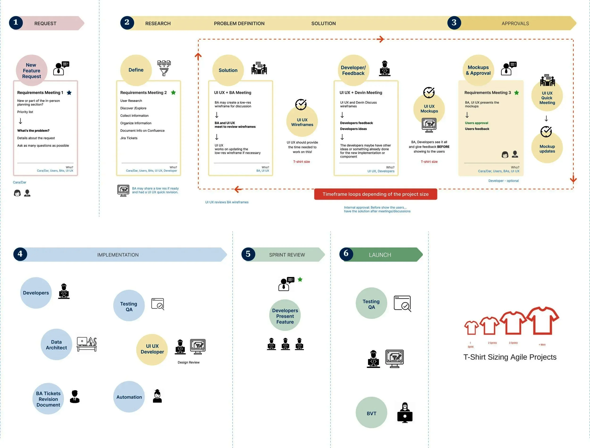
Organized the team workflow in 10 steps, and T-shirt size recommendations:
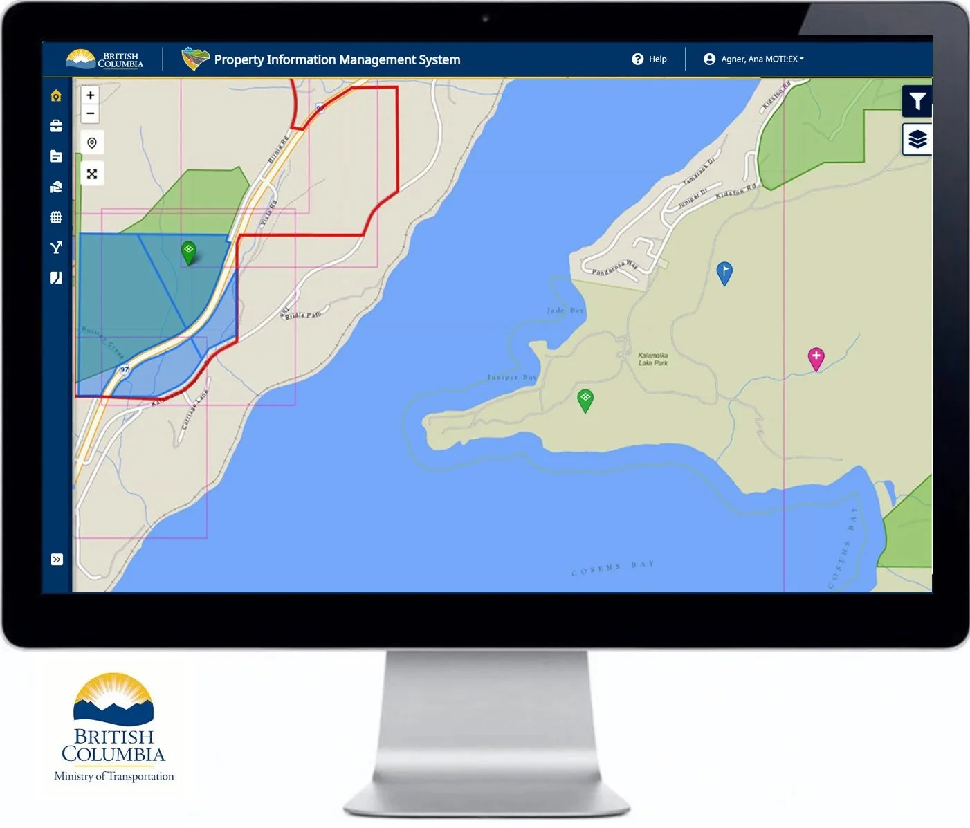
Wireframe for the advanced filter map: