family.legalaid.bc.ca
LegalAidBC
Senior Product Designer (UI UX)
Led the redesign of a 900+ page family law platform focused on improving accessibility, usability, and content clarity for diverse and low-literacy audiences.
Key Responsibilities & Contributions:
Redesigned core user journeys, navigation, and information architecture within a cross-functional Agile team
Created wireframes, UI systems, reusable components, and accessibility-focused layouts aligned with WCAG AA/AAA standards
Developed supportive UX patterns, visual systems, iconography, and content structures to improve comprehension during sensitive legal processes
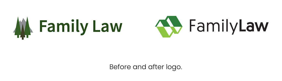
Designed the project logo and visual identity, extending the system across digital, print, transit, and marketing materials
Collaborated directly with stakeholders, developers, and content teams to maintain consistency across the full product experience
Impact / Results:
Improved usability and navigation clarity through research-driven design decisions
Delivered a scalable and accessible design system supporting long-term platform growth
Increased engagement through emotionally supportive and user-friendly service experiences
Enhanced the product with inclusive visuals, emotional support patterns, and accessible guidance systems using colour-coded steps, illustrations, and plain-language content.

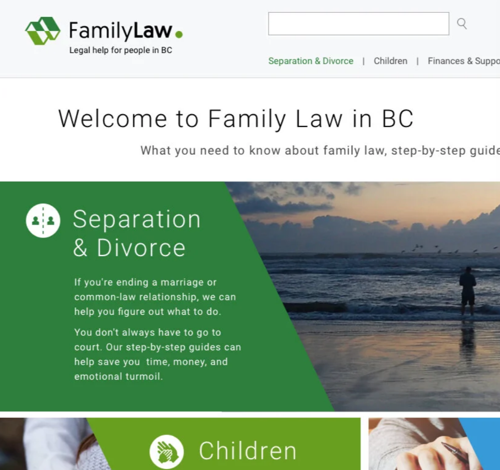
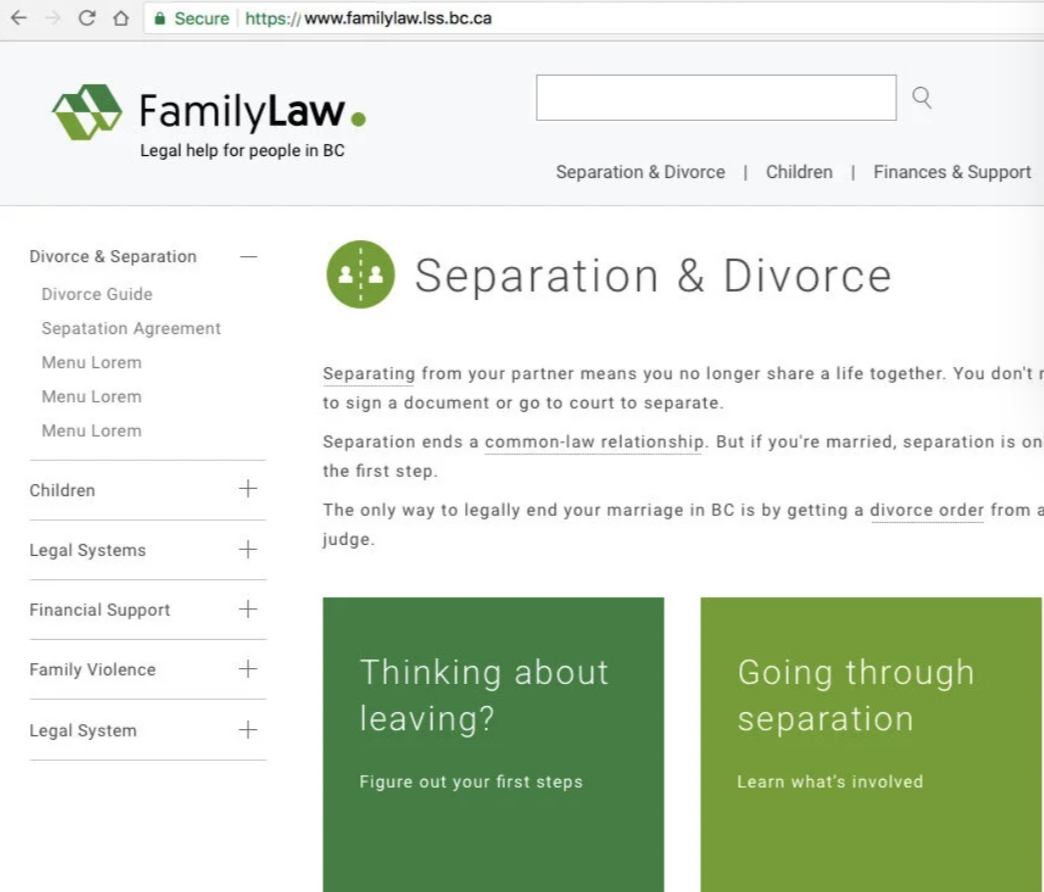
Designed the new functional and appealing familylaw.lss.bc.ca. Worked with the team organizing the structure of the homepage, menus, landing pages. Created the new logo, look & feel, selected more inclusive imagery for the website.
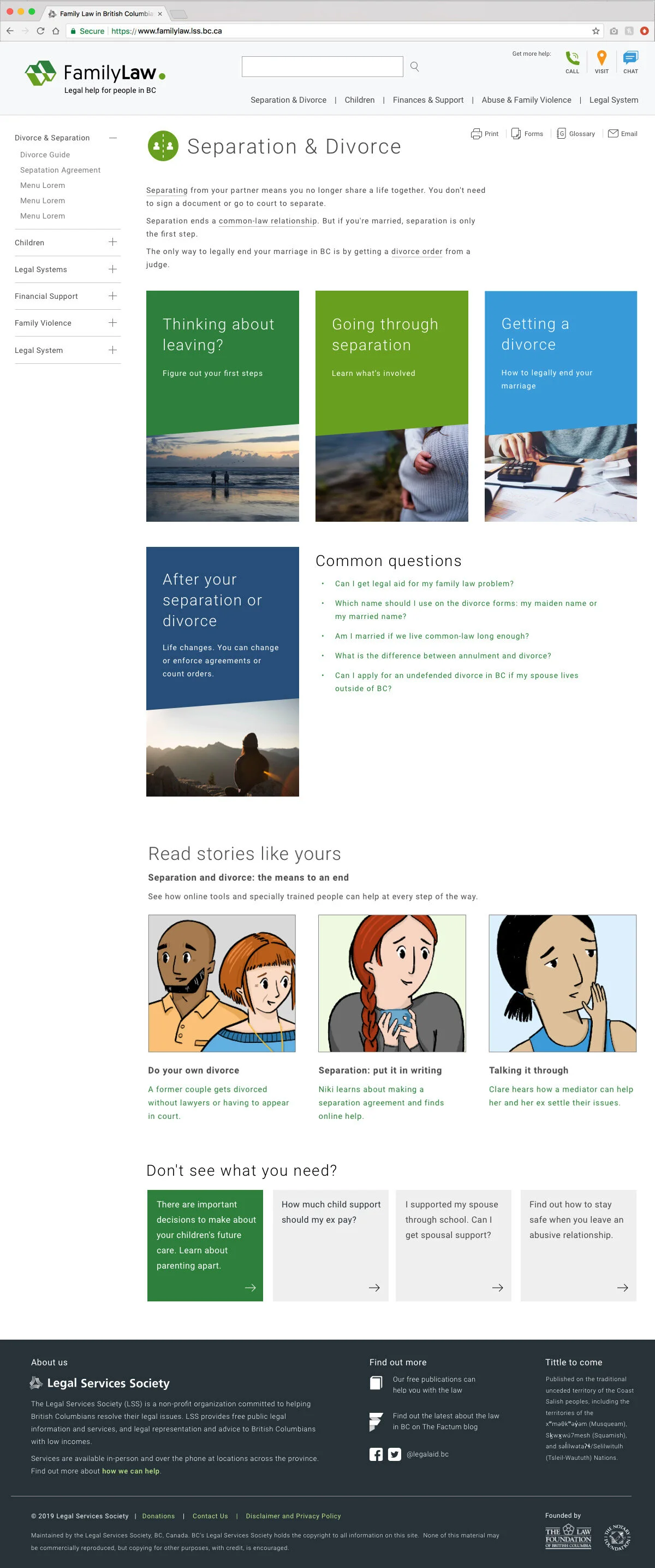
Landing Pages: organized in a more straight forward way the content. Created landing pages, recommending illustrations for scenarios, and created a design system.

Recommended the usage of a step-by-step guide. People now can understand where they are in the process.

Clean fonts, readability, and good user test feedback with the new updated website.
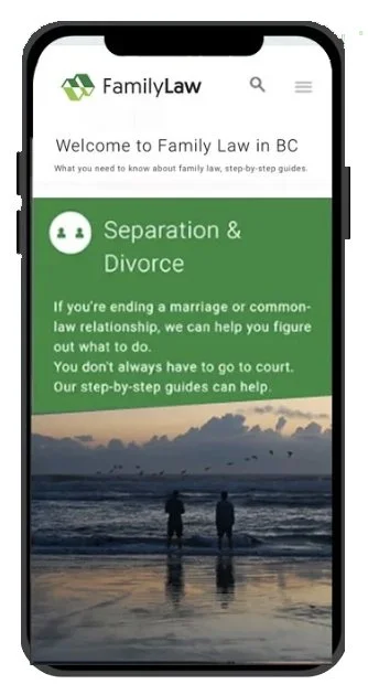
Designed a new logo for the family law website, symbolizing two houses moving in different directions, the green mountains of BC, and a final dot representing resolution and the conclusion of the problem.
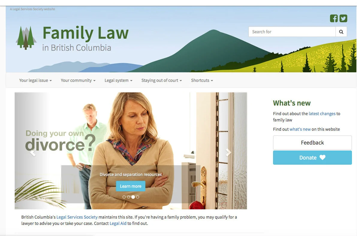
Before: heavy images and missing important information.

After: welcoming page, warmer, more unique, more inclusive imagery, the 5 most important topics divided in a clear way.
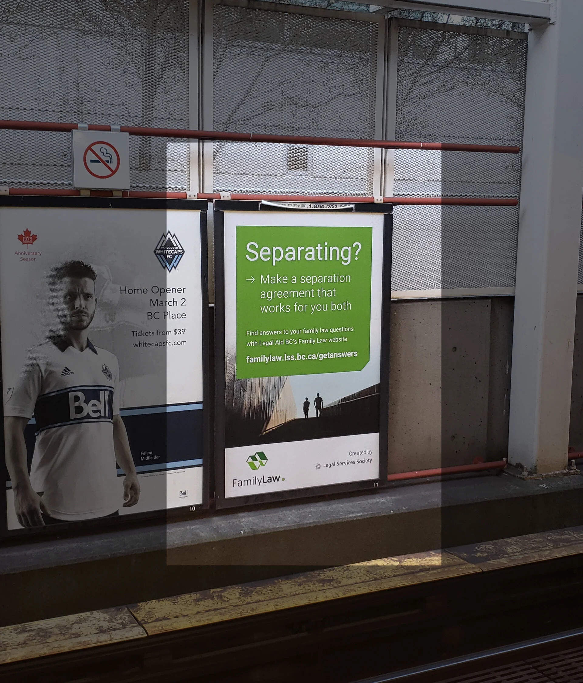
Ads in the Vancouver area Skytrains

Ad displayed in the Vancouver area buses

Newspaper and Digital Ads

