IT Glue
UI UX Designer
Key Responsibilities
Engaged in collaborative design processes, working closely with product managers and engineers to create a clean and elegant UI across multiple features.Collaborated with cross-functional teams to improve usability and design consistency, contributing to product growth from 35 to over 300 active users.
Led the refinement of visual designs for user interfaces, site layouts, and production templates in Sketch, improving consistency and streamlining handoff between design and development.
Goals & Results
Here are some specific challenges faced during the project:
Design System Development: Transitioning to a comprehensive Design System required meticulous planning and execution to ensure consistency across all design elements, addressing the absence of a pre-existing framework.
User-Centered Design: Applied industry best practices to create responsive designs for all screen sizes, enhancing accessibility and navigation to meet user needs on both mobile and desktop platforms.
Accessibility Compliance: Revised the Dark Mode version of the IT Glue product to adhere to Accessibility Web Standards, ensuring an inclusive experience for all users.
Client Collaboration: Effectively distilled diverse client ideas into cohesive designs through iterative feedback loops, aligning closely with client expectations.
User Interviews: Conducted and participated in user interviews to identify UI/UX issues and solutions, creating actionable tickets for the team.
Visual Enhancements: Revamped graphics for the Digital Bulphish Report, making it visually appealing and easy to digest for users.
3D Icon Design: Designed 3D icons for the major website, enhancing visual engagement and brand identity.


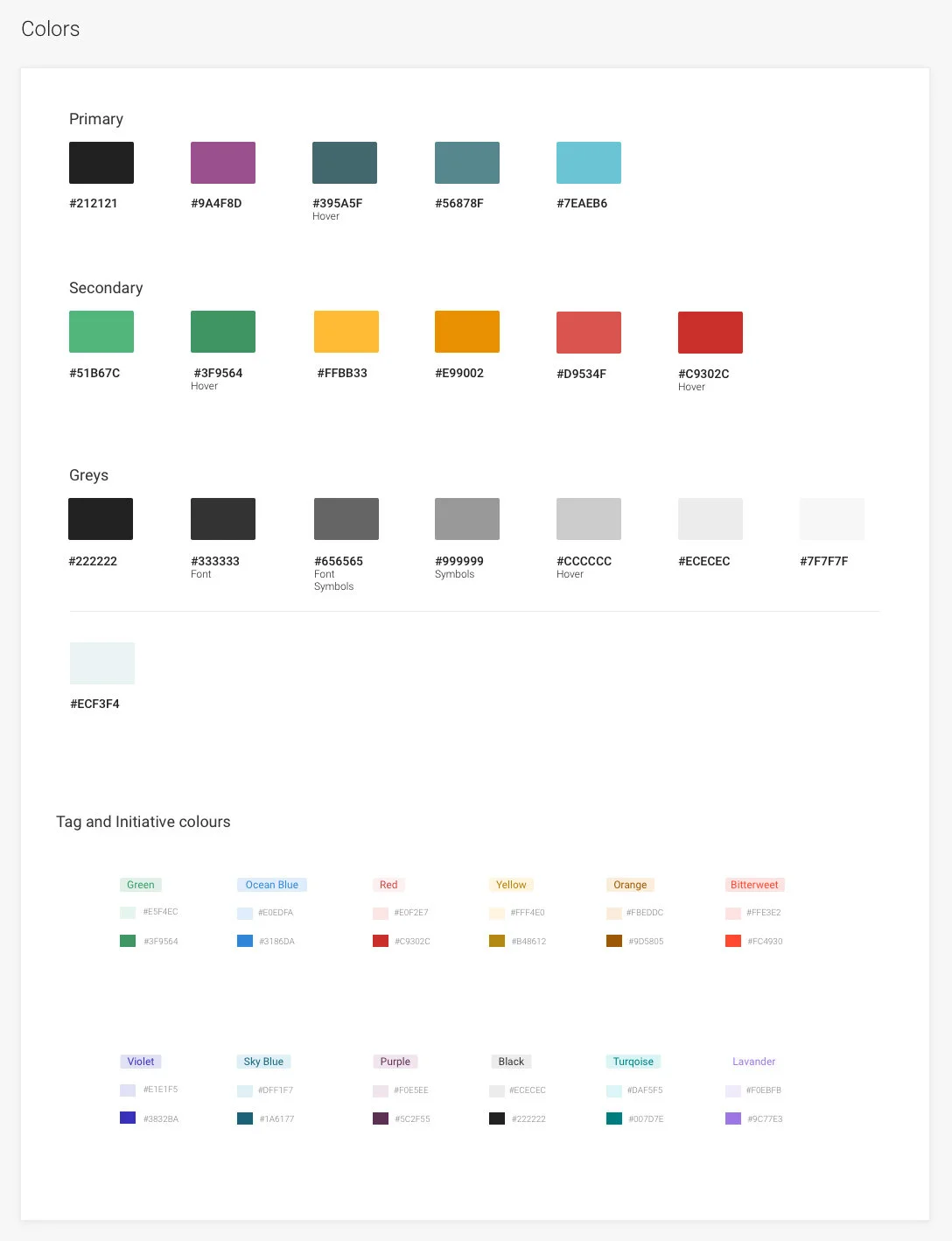
Color palette displaying various primary, secondary, grey, and tag colors with their hexadecimal codes.

Table showing typography styles including size, line height, weight, and example headings.
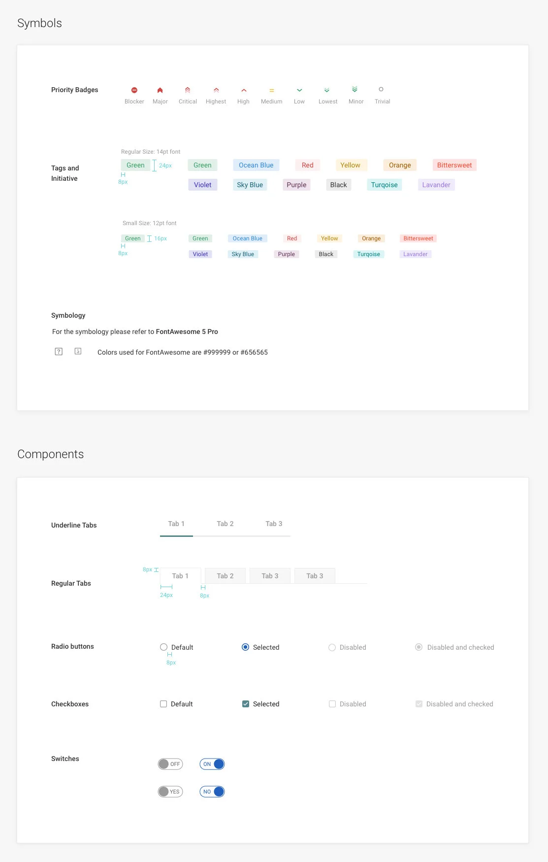
A design guide displaying symbols for priority badges in different sizes, tags with various colors, and component styles such as underline tabs, regular tabs, radio buttons, checkboxes, and switches.
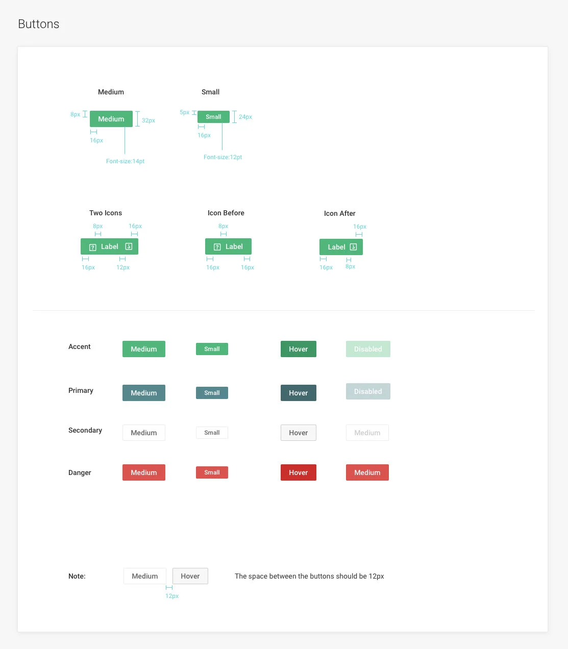
A style guide for buttons, icons, and states with dimensions, font sizes, and color descriptions, including normal, hover, disabled, and danger states. Contains sections for button sizes, icon styles, and color schemes with notes on spacing.
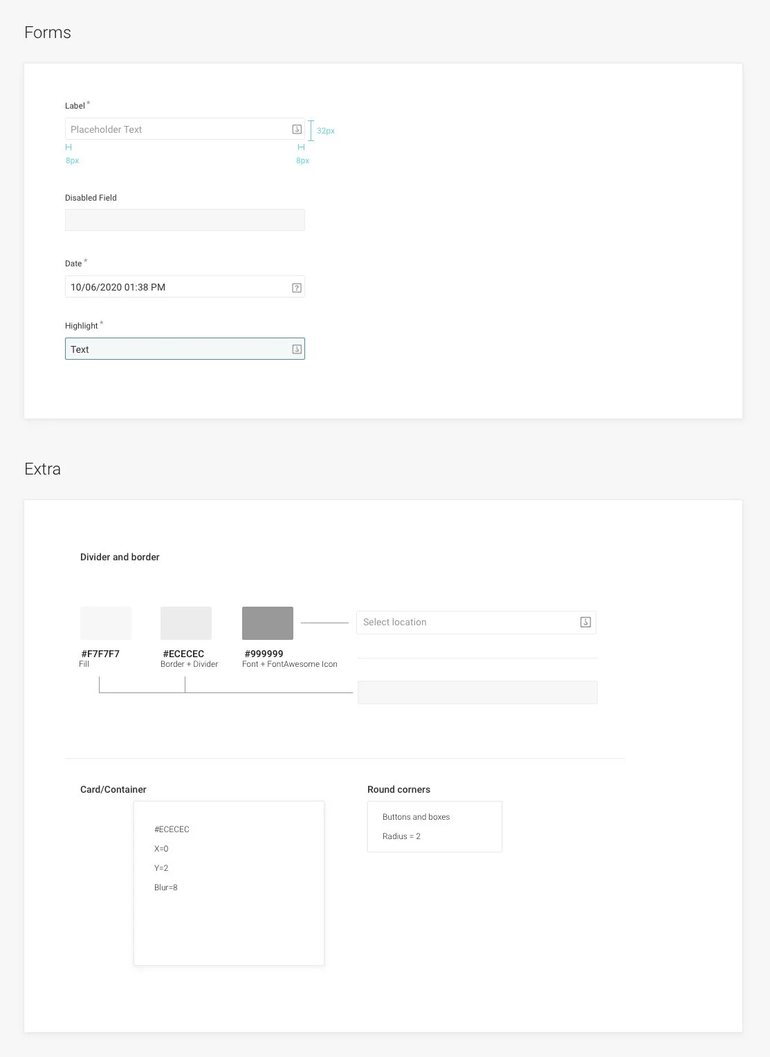
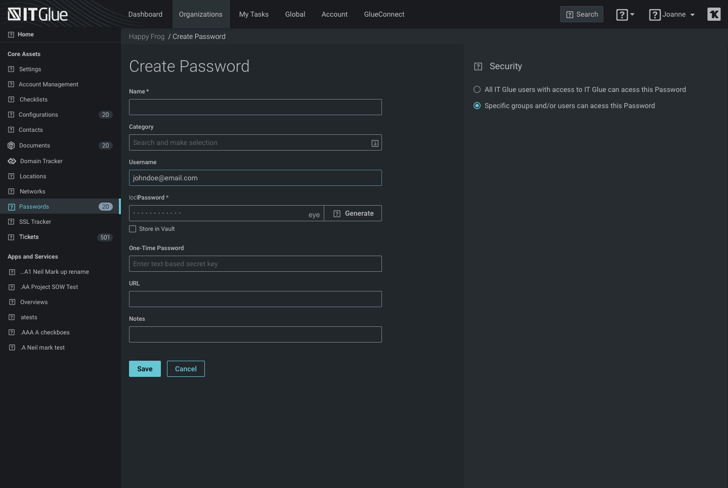
Screenshot of a form design interface with sections for labels, disabled fields, date, highlights, and additional styling options like color, border, font, icons, and rounded corners.
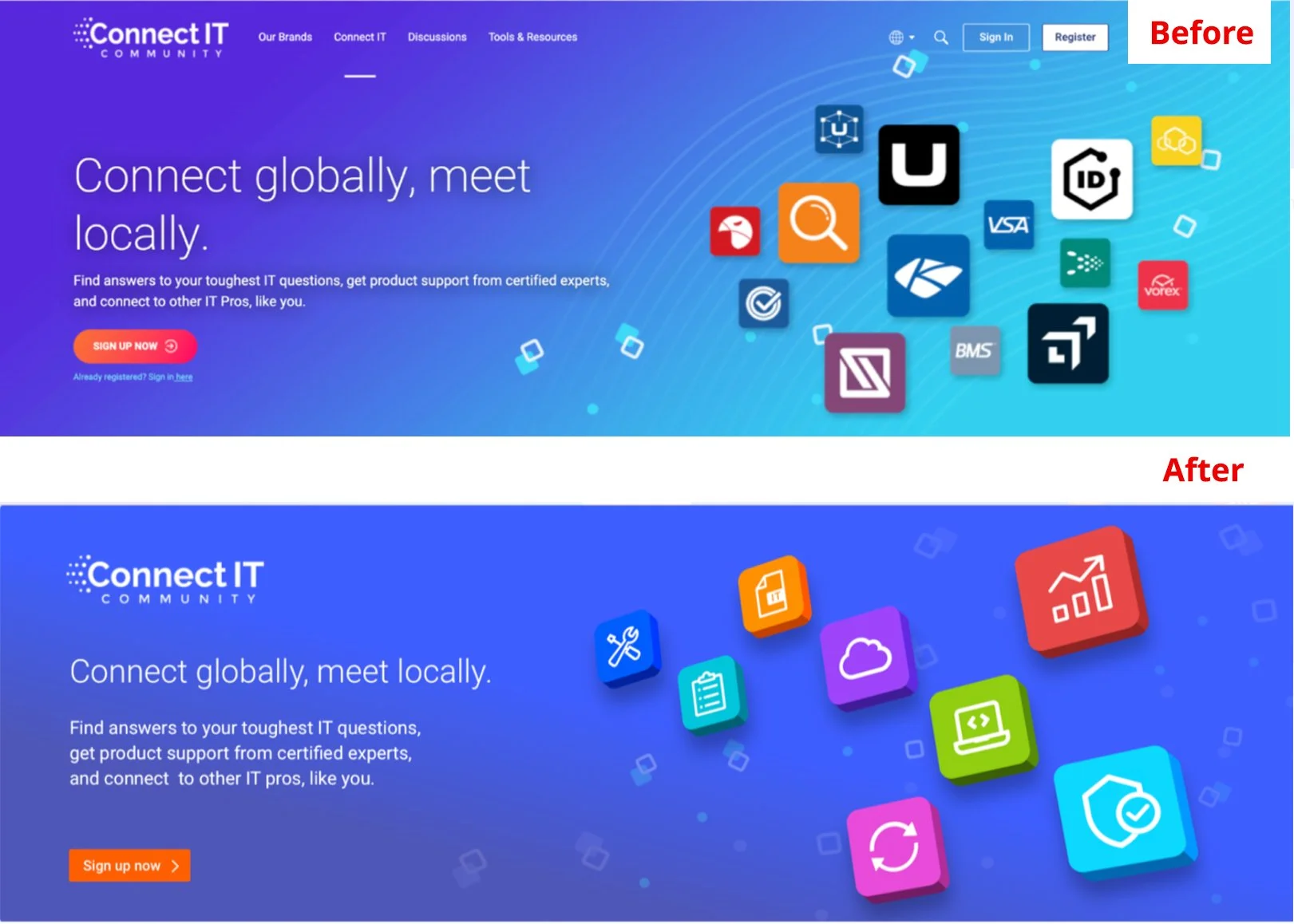
Comparison of a website page before and after update. The 'Before' section shows a cluttered design with icons and a call-to-action button. The 'After' section presents a cleaner, modern layout with colorful icons and a sign-up button.