Metronome Systems
Product Designer
Metronome Systems
Product Designer
Metronome Growth Systems is a SaaS platform designed to help CEOs, business leaders, and coaches manage strategic planning, team alignment, and execution of business goals.
Key Contributions:
Leading end-to-end product design for scalable, accessible and strategic UI/UX.
Built all mockups and visuals aligned with the product roadmap.
Creating the foundation of our design system (components, structure).
Presented the Lipstick Project in one week through fast iteration and stakeholder
alignment — earning excellent reviews from users, the team, and the CEO.
Crafted icons that added value to the product. Created product vision.
Conducted user interviews to inform UX and feature priorities; collaborated
with developers to ensure clear specs and smooth handoffs.
Collaborated closely with product, engineering, marketing, and the CEO.
Using AI tools to speed up design, research, and documentation.
Building the design practice from scratch—fast, clean, and user-first.
Suggested a hybrid implementation for the new product.
Mentored a Junior Designer, guiding the mobile version.
Delivered UI/UX and visual design improvements, including branding, icons, and inclusive photography. Created emotional support “bubbles” and organized UX guidelines with step-by-step instructions and colour coding, while recommending illustrations instead of videos to enhance clarity, accessibility, and readability:

Designed the new functional and appealing familylaw.lss.bc.ca. Worked with the team organizing the structure of the homepage, menus, landing pages. Created the new logo, look & feel, selected more inclusive imagery for the website.
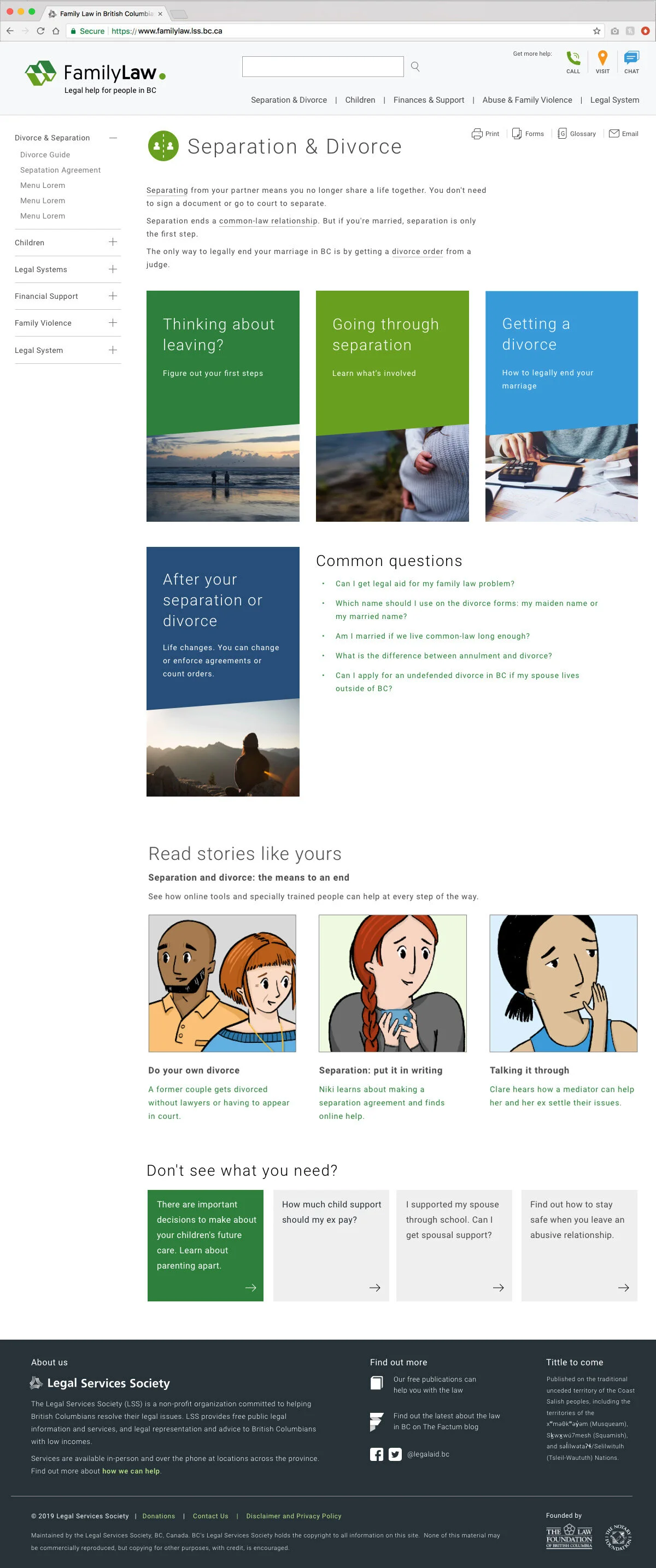
Landing Pages: organized in a more straight forward way the content. Created landing pages, recommending illustrations for scenarios, and created a design system.

Recommended the usage of a step-by-step guide. People now can understand where they are in the process.

Clean fonts, readability, and good user test feedback with the new updated website.
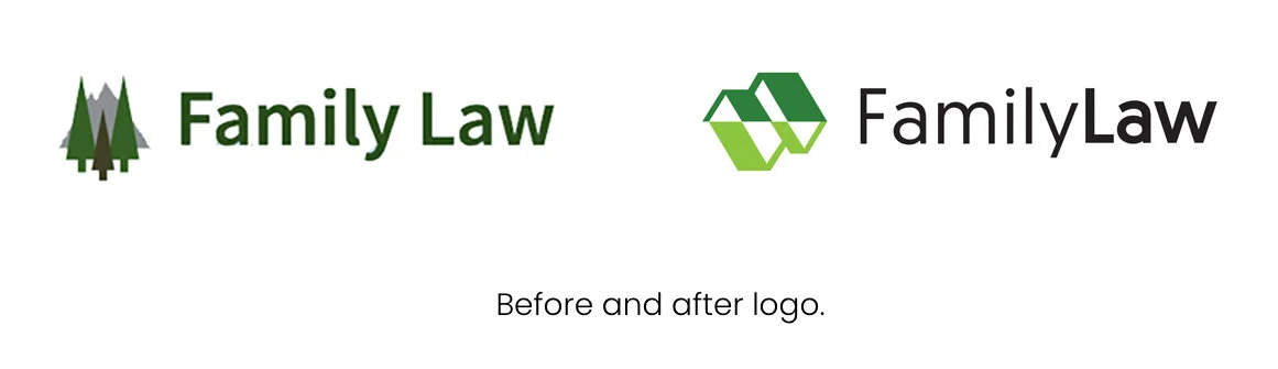
Designed a new logo for the family law website, symbolizing two houses moving in different directions, the green mountains of BC, and a final dot representing resolution and the conclusion of the problem.
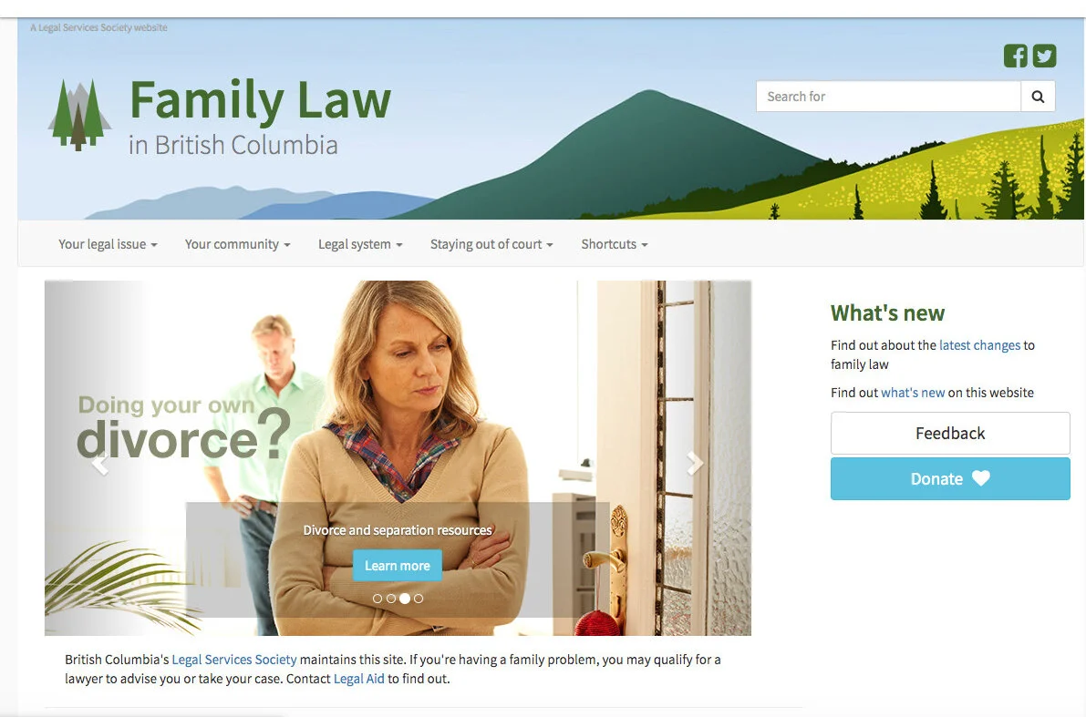
Before: heavy images and missing important information.

After: welcoming page, warmer, more unique, more inclusive imagery, the 5 most important topics divided in a clear way.
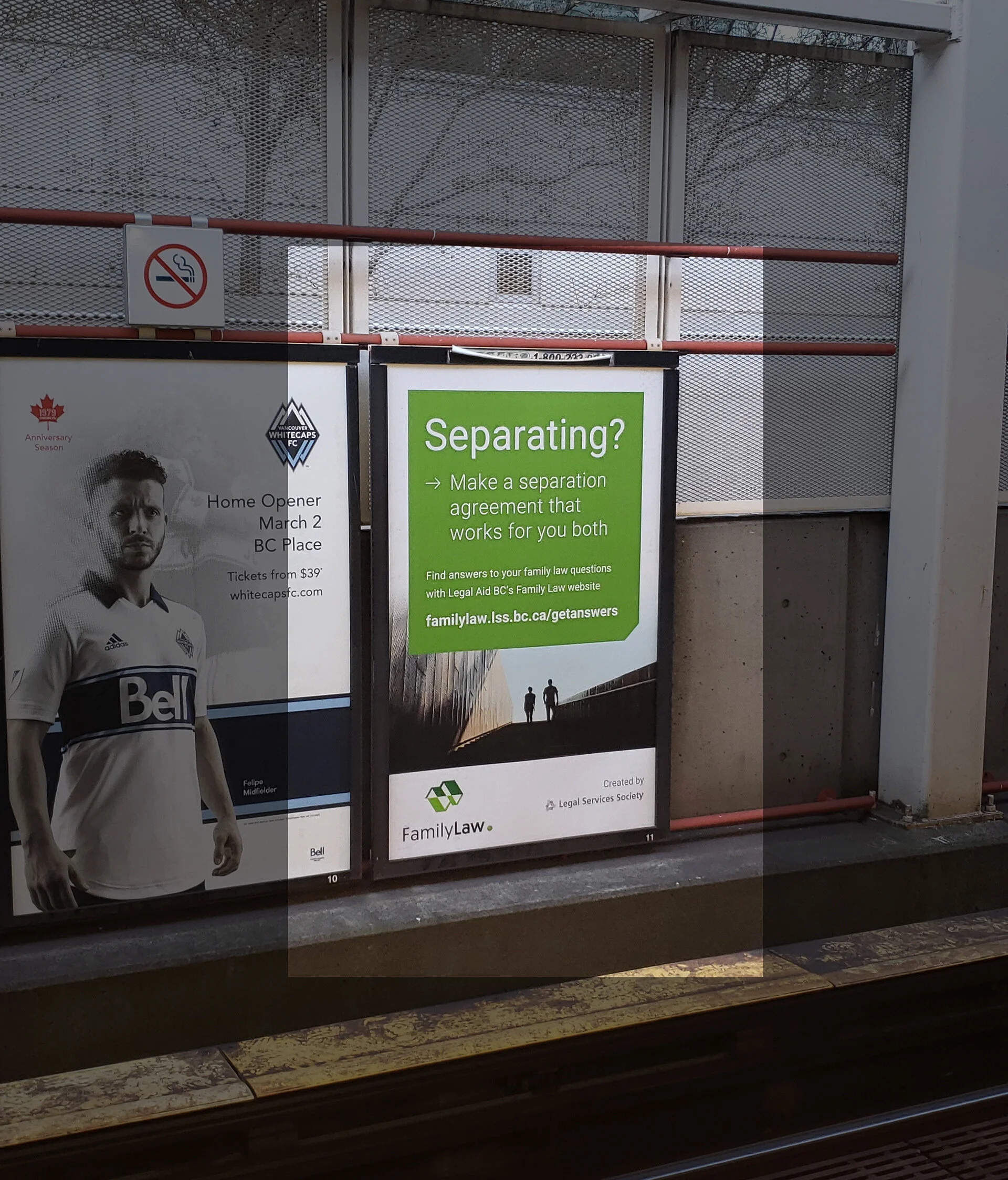
Ads in the Vancouver area Skytrains

Ad displayed in the Vancouver area buses

Newspaper and Digital Ads


Computer and smartphone screens displaying the Family Law in BC website, with an image of two people standing on a beach at sunset.